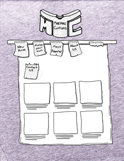
One of my first ideas for a site was a t-shirt design site. Where you could go in and design your own t-shirt. The navigation tabs would be little t-shirt tags you could rip off with your mouse to navigate to that page. The style of the site was suppose to be like a note book drawing. I really enjoy the sketchy style of sites, and the hand drawn. The logo is an MC, which stands for Marshall Customs.
|
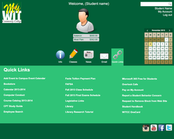
My college needed a site overhaul. So I gave my best to design a clean, simple and informative site. You could go online and see your balance and your grades with ease. You could also modify your profile picture, and maybe right something about yourself.
|
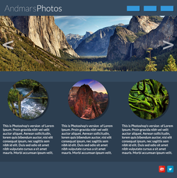
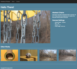
I started Digital Photography this year and I wanted to design a site that would show off my pictures. I really liked the color combinations on this site and the style of it. A big slideshow and little circles with pictures in them. I think that different shapes that compliment each other looks nice in my opinion.
|
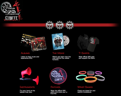
I made a site for one of my favorite bands, Steam Powered Giraffe. I liked the idea of making the navigation tabs cogs that would spin when you hover over them. It would be simple with CSS transitions. The home page is a big picture of the band and the store is a grid layout of their products. You should check them out!
|
I made another photography site, like my other one. But this one is much cleaner and has a more square look to it. This site also has some css transitions in it. The thumbnails below would rotate, fade in or out, zoom and pan.
|
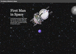
One of my most impressive sites was a site about the history of mankind in space. The site has a heavy amount of parallax scrolling to it and was very tricky to make. I had to fool around with JavaScript when I didn't know it all at. But with a little work here and there, I was able to make my way through it and create this site.
|
